Sunday, November 29, 2009

Artist blog - Stephen Vitiello

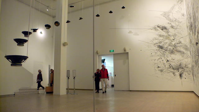
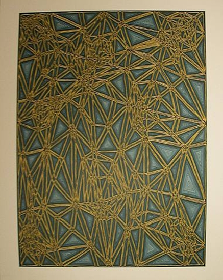
“Untitled” with Julie Mehretu, dimensions unknown


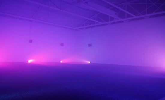
Four Color Sound, dimensions unknown
w/ Lighting Design by Jeremy Choate

The first song on the sounds page of Stephen Vitiello's website reminds me very much of Mogwai or Godspeed You! Black Emperor. It had a strange structure and rhythm to it. He said it was made for someone as a supplement to their song, I would like to know what the final song sounds like. If someone were to give me this to build a song over, I believe I would have a tough time understanding the rhythm and playing something that didn't feel almost random. However, the randomness of it is interesting in how the asyncopation still seems to work.
Tom mentioned in our meeting that the root of sound art was in electronic music and asked if I listened to any of it. I said that I don't really like electronic music. I guess I had the wrong idea of what he was talking about because I was thinking of something like dance or techno music, which I don't enjoy for it's excessively repetitive thumpclapthumpclapthumpclapthumpclap. However, Vitiello's work is not this, his is much more interesting and complex. It's funny that in the endless possibilities of electronic music, the standard that pop-culture has landed on is techno music, or at least that is what I associate electronic music with.
Vitiello's sounds can be heard here:
http://www.stephenvitiello.com/index.php?id=C0_4_2

I know one of his songs is composed of some of his nature recordings, but I would like to know how he makes some of his other music. I understand the method of slicing up a recording and putting pieces of it to a rhythm, but he also does some strange stuff which seems to be made from a synthesizer but seems too organic to be composed of a computer generated beat or note pattern.

Wednesday, November 25, 2009

Research blog - some music theory

For this blog I want to read up on some music theory because now that I am dealing with color relationships, I should better understand musical relationships. The first thing I came across looks like an excellent piece of the puzzle, the circle of fifths. To relate this to color, using my graph I've charted out how the colors are related according to the way the notes are related in the circle of fifths. However, I am unsure of how to deal with the inner circle of relative minors, here I have just colored them the same as their major counterparts. Perhaps when dealing with chords of minor, major, or other orientation, each note that is in the chord should be included somehow in its color representation. This chart is begining to show me some very complex relationships that seem to work mutually in color and musical theory. I will have to study this a lot to figure out what all these colors and notes mean for each other, however I may limit it to F-B which are the keys I tend to use most often when making music. The first thing I noticed and something that was confusing me in my other color chart was when I attempted to find the complimentary colors for G and its fifth, D, I got green and purple, rather than green and red. It seems in music complimentary notes do not work back and forth as in color theory, however it makes sense when I read that when the colors are made by light the visual complimentary of green is purple, or violet. Basically, when colors are made subtractively then red and green compliment, but when made additively green and purple compliment. This is very interesting because it seems the same things that makes a melody sound good or give a certain feeling, is the same thing that makes a color field painting look good or give a certain feeling.


Saturday, November 21, 2009

Artist Blog - Piet Mondrian

Broadway Boogie Woogie, Piet Mondrian, 1942-1943 oil on canvas


Piet Mondrian, Tableau 2, 1922, 0il on canvas, 22x21


Mondrian, Piet
Composition A: Composition with Black, Red, Gray, Yellow, and Blue
1920
Oil on canvas
91.5 x 92 cm (36 x 36 1/4 in)

Today I want to talk about Piet Mondrian. He was brought up during my critique as being similar to what I am doing. Like my work, his work is influenced by music, jazz in particular. Also like myself his work was also an exploration of his spiritual beliefs. However, other than his musical influences and spiritual interest, I don't really see how these are really visually like my work, other than the use of structure and blocks of color. I feel like it is more about order and spiritual ideas rather than musical ideas. I don't think my work could be classified as De Stijl either, I think of it more as color fields. I enjoy Mondrians work, but I find it strange that he was mentioned because I don't really see it as musical and it wasn't an influence in the creation of my work.

Thursday, November 19, 2009

Francis Cape Lecture 11-18-09

I attended Francis Cape's lecture on Wednesday and found it to be thoroughly boring and dissappointing. I found the a lot of the work to be unattainable, and without the help of a long discription, I would not have had any idea of what he was referencing. Even in the lecture at times I was having trouble understanding the correlation between his work and what he was talking about. For example he stated that he was interested in how long buildings and cities are meant to last but I couldn't find that in his work.

Wait, 2002
wood, paint
108 x 142 x 48 inches
London Avenue, 2008 poplar, sandbags, text
96 x 156 x 36 inches


258 Main Street, 2002
wood, paint
89 x 89 x 20 inches


The Angle of a Landscape, 2007
wood, paint, C print
81 x 108 x 29 inches


Ama, 2003 wood, paint. 96 x 79 x 38 inches rear view


A lot of his work references some British catalog of utility furniture which I still don't really understand and deals with the recurring theme of a wall with attached chair or desk. Maybe it's connected to the utility furniture, but I'm not sure what the significance of this is. He seems to be doing the same project over and over assigning different meanings to it. It seems strange to me.


Waterline, 2006
17 framed C-prints
image size 11 1/4 x 16 1/2 inches; frame size 17 x 25 inches each
wood, paint

dimensions variable


He also did some photographic work entitled Water Line based on hurricane Katrina. The photographs were the same old photos we've all seen before destroyed houses, however these were much more interesting than his other work; he painted the walls of the space up as high as the water level in the photographs. It really brings you into that space and feeling of having water up to your waist. Incorporating the space in this way is something I could consider in my onw work. The only other thing I got out of Cape's work was to make sure my work is about what I am talking about, I know this came up in my critique and I don't want it to happen with my work.

Wednesday, November 18, 2009

Research blog - sound perception


I've been looking at some of the ways people perceive sound and something I've come across that I found interesting was ideas about absolute and relative pitch. Absolute, or perfect pitch, is someones ability to make a note on command, like if you were to ask them to sing a G note, they would be able to do it without hearing the note first. Basically the ability to recognize a note and name it. It is a rare ability and many say that it cannot be learned, or must be learned at a very young age. On the other hand there is relative pitch which is more common and can be intrinsic or learned through training. This is the ability to recognize relative differences between notes. I think I have relative pitch because when playing music, I play by ear but I could not name a tone that was given to me. I've been recording a lot of music lately and something else I found interesting was the impact the room has on a recording as far as acoustics and reverberation is concerned. I also found that there are digital ways of correcting some of the problems caused by not recording in a perfectly balanced sound booth. This will be something to look into for improving the quality of my recordings except when it comes to these sort of things there are a lot of extremely technical things that I know nothing about but am slowly trying to teach myself. It is a complex science/art. Here is a graph of an uncorrected wave vs. a digitally corrected one. Since my apartment is not a perfect recording studio this could prove useful in cleaning up my recordings if I can figure out the program for it.


Saturday, November 14, 2009

Artist blog - John Cage


11 Stones, 1989, dimensions and medium unknown
Where There Is Where There Urban Landscape No. 19, 1987-89, dimensions and medium unknown


Variations III no. 14, 1992, dimensions and medium unknown


Today I want to talk about John Cage. He was an artist, poet, philosopher, composer, and music theorist, best known for his experimental music compositions. His most famous piece is 4:33, which consists of 4 minutes and 33 seconds of silence, where the sounds of the atmosphere and reactions of the audience become the piece. I chose to talk about him because I always thought 4:33 was really interesting and when I found out that he also works in the visual arts i was intrigued. I really enjoy the textures in his paintings, they feel soft and weightless but with dark undertones, it really seems to compliment his music. It's almost like what I've been doing, but instead of him connecting the music to the images, I am seeing relationships in his work on my own. Some of his music compositions are a bit strange for me but I definitely a lot of it like the link I have below. Many of his compositions are based on the I Ching book of changing events, which I think is very interesting. He refers to music as "an affirmation of life – not an attempt to bring order out of chaos nor to suggest improvements in creation, but simply a way of waking up to the very life we're living" I thought this was an outstanding explanation and is something I think can apply to visual art as well. I was also interested to find that one of his teachers was Arnold Schoenberg, I have some of his compositions and I really enjoy his style as well.

Here is a link to some of his musical work. http://en.wikipedia.org/wiki/File:Cage-cheap-imitation-exceprt.ogg

Wednesday, November 11, 2009

VMFA application


Nature Machine, oil pastels over photocopy, 2009, 36"x48"


Circles, Watercolor on canvas, 2009, 18"x24"


Sustainability, wood, steel, coal, Plexiglas, spray paint, 2008, 6'x6'x6'


Disorientation 1, silver-halide photographic print, 2007, 18"x24"


Disorientation 3, silver-halide photographic print, 2007, 18"x24"


Disorientation 4, silver-halide photographic print, 2007, 18"x24"


Flowerpot, steel, dirt, canvas on canvas, 2006, 24"x30"


Texture Field, wood, steel, dirt, canvas, on canvas, 2005, 18"x24"


RESUME:

Justin Lewis
XXX X St. apt XXX
Richmond, Va
23224
804.306.XXXX
lewisje@vcu.edu

Education
Diploma from Atlee High School
Member of Art Guild and National Art Honor Society
Senior Photography Student at Virginia Commonwealth University

Awards
2004 Honorable Mention “Visions 2004” Photo Contest
2005 Silver Key and Honorable Mention in Scholastic Art Awards
2005 Finalist in Photographers Forum Magazine Annual College and High School Photo Contest
2005 1st Place in Architecture Category of “Capture Maymont on Film” Photo Contest

Solo Exhibitions
K. Baucom Salon
6113 Lakeside Ave. Richmond, Va
3.09 - 8.09

Current Employment
Pizza Hut - Delivery Driver
1164 Wilkinson Rd. Richmond, Va

Research Blog - A brief history of sound recording


Since my project is now incorporating sound recording I thought I would check out the history of sound recording. The first way people could record music was with the invention of machines like the music box. These were basically mechanized instruments that played interchangeable dimpled cylinders. In 1860 the phonautograph recorded the first human voice. The quality was terrible but in 1877 Thomas Edison invented the phonograph which was the first effective way to record sounds. The phonograph also was capable of playing back recordings whereas the phonautograph could only record. In the early 20's breakthroughs in electronics brought on new discoveries of electrical ways of recording and hearing sound. New microphones, speakers, mixers, and recorders were developed that worked by electric means. With the development of the magnetic tape, recordings could now be precisely edited, and recorded over and over on the same tape. From there quality was improved through things like Dolby noise reduction, hi-fi stereo sound, and surround sound. Now that we are in the digital age, this is the primary means of recording, using computers or digital recorders to edit and record sounds.

Artist Lecture - Shimon Attie


Shimon Attie, Present day refugee with dormitory ship ("Flotel Europa") used to house refugees in Copenhagen harbor, 1995, 2 X 1.75 meter "fuji-trans" photograph mounted on light box submerged 1 meter under water, Borsgraven Canal, Copenhagen, Denmark


Shimon Attie, Mulack strabe 37 - former Jewish residence 1932, slide projection of Jewish residents, 1993


Shimon Attie, The Attraction of Onlookers: Aberfan - An Anatomy of a Welsh Village, high-def digital video, date unknown


I enjoyed the first project he showed, but for the most part I was not impressed with Attie's work. His first project was of projections of old photographs on the same buildings that the old photos were taken at. The aesthetic of this was interesting to me and it was an interesting juxtaposition of past and present, but like the rest of his work, I found the subject inaccessible. All his work seems to deal with historic stuff and honestly I find no interest in it. Even though the projection project dealt with German history and I am part German, I still don't really get it. He also did a project on the Welsh village of Aberfan where he asked "what does it take to make a Welsh village?" This made me wonder, who cares? What does this mean for or have to do with me? I understand it was about the tragedy that happened there, but other than trying to show the residents differently than they had been before I'm not sure what this had to do with these people. He made claims like "every Welsh village has a South Asian store owner." Does every Welsh village have a South Asian store owner and why is that? It seemed totally ambiguous. How is this different from any other village, town, or city? I also couldn't understand his recurring method of having people standing still while they rotate on a platform in a black void as if they are statues in a museum. For some reason, it made me angry because I couldn't understand why this was even art, it just seemed weird, random, or inaccessible to me.

Artist Lecture - James Siena


James Siena "Multi-Colored Nesting Unknots" 2004, Gouache on paper, 11" x 8-1/2"


James Siena "Enter The Faces" 1996
enamel on aluminum
19-1/4" x 15-1/8" (48.9 cm x 38.4 cm)


James Sienna, "Corner Drawing", Second Version, graphite on paper, 10 3/4 x 8 1/4", 2000.


James Siena, Battery Variation II, 46 ½ x 37 ¼ inches , 2005, medium unknown

James Siena "Twirly 2" circa 1994-1995, medium and dimensions unknown


James Siena, "Shifted Lattice", 37x27.5", date and medium unknown


I went the the James Siena Painting and Printmaking lecture and found it outstanding. His work really deals with some of the ideas I've been working with this year. Ideas about natural rhythms and patterns. His work particularly reminded me of a research blog I did about sacred geometry. All of his work has a natural flow to it and the way the elements interact and change is very organic. "Multi-Colored Nesting Unknots" and "Enter the Faces" especially reference sacred geometry with the apparent use of fibonacci sequences, they make me thing of this image:
He says his work is built upon a series of rules that he has laid out for himself. This is interesting because it reminded me of my methods of relating music to visual art. Sometimes he will make varying pieces based on the same rules but with different colors making them appear totally different. I really like how he uses rhythms and patterns, they seem to give the paintings a movement or vibration to them. I liked that he said he sometimes breaks his rules because his work is so natural and his thought process is another natural element in the making of his work so if he has a thought to do something different he goes with it.

Saturday, November 7, 2009

Artist - Aphex Twin

Today I want to talk about Aphex Twin or Richard David James. I suppose I really only want to talk about one of his songs that relates to my work. While he does do photography for some of his album covers, most of his art lies in his music. Not only is it some of the most influential and original techno music there is, but he has expanded it into the visual realm as well. In his song Mathematical Equation he has converted an image of his face into sound. When the song is played back through a spectral analyzer the tones of the song produce an image in the spectogram.
Image of spectrogram in Aphex Twin - Mathematical Equation at 5:27

And here is a video for the analysis the rest of that song, the face happens at 5:27.


I think this is amazing and didn't know it could be done. I will have to find out how to convert an image to sound like that, it would definitely be something I might want to use in the future. It is very explicative of some of the things I've been talking about, that there are no borders, that there are only places where seemingly different things weave together. It could also be used to talk about the subliminal. I wonder if it is possible to show a whole story in a song. Of course the sounds that this produces are not really the sounds I would choose to use musically so I wonder if there are any other different ways of achieving something like this.

Wednesday, November 4, 2009

Research blog - Sound Art

For my research I've been looking at sound art. I found a quote by art historian Don Goddard that I thought was really interesting and related to my work," It may be that sound art adheres to curator Hellermann's perception that 'hearing is another form of seeing,' that sound has meaning only when its connection with an image is understood... The conjunction of sound and image insists on the engagement of the viewer, forcing participation in real space and concrete, responsive thought rather than illusionary space and thought." So I got thinking, I really need to make the strength between my images and sounds more evident, so I thought what is another dimension in which they could interact? What if I record sounds for the length of a photograph, using a variety of shutter speeds. This will definitely be something to explore even though it may be moving further away from some of the ideas I've been trying to work with. I also found some awesome sculptures made from sound, unfortunately the website I found these on doesn't specify the artist names or any other information.

Monday, November 2, 2009

Critique Video

My video was slightly painful, but I thought it was going to be way worse than it was. The first thing I noticed was that I looked very serious or angry or maybe scared. I don't know if maybe I always look like that, but I suppose I was a bit nervous because I knew right away that the piece wasn't being viewed properly. I guess it doesn't matter because I'm not going to try and change my face for my next crit, I'm going to look how I look. However, one thing I could try to work on is that I say um and like a lot and I kept doing something with my mouth, playing with my tongue or something. I should refrain from um and like and try not to do fidgety things like play with my tongue. I also feel like I could have responded better to some comments that were made, because in some cases I didn't even respond at all, I guess I was preoccupied with thinking about what was said. I should try to offer a response of how I feel about the comment or how I may be able to use it. When I am reading my artist statement I kind of rush through it and I think it may have been difficult to understand at some parts. I should slow down and make clear what I am saying.

Sunday, November 1, 2009

Artist Blog - Yoko Ono and Charles Spearin

Today I want to talk about Yoko Ono. She was mentioned during my critique for her use of sound art. I like her work because she dabbles in all sorts of mediums from performance, to video, to music, to sculpture, much like the way I like to work. I also like the simplicity of a lot of it. I couldn't find any of Ono's sound art pieces, only music videos of her dance music, which I wasn't impressed with. I am downloading some of her other music though so when that is done hopefully I will get a better idea of what her sound art is all about. Here are some pictures of her installations which I liked.

Yoko Ono, Painting to hammer a nail in, 1966, dimensions unknown


Yoko Ono, Play it by trust, 1966-1998.

Yoko Ono, Telephone Piece, Ono periodically calls this phone during the exhibition. date unknown

Also Marion suggested I look at Charles Spearin's conceptual album, The Happiness Project.
I listened to the whole thing and it was very interesting how musical a normal voice is. A little critique though; the accompanying music the the voices on the album had a certain style to it which works in most of the songs, but for some, for example in the last track, Mrs. Morris (Reprise), the jazziness of her voice's instrument doesn't really lend itself to the style of most of the album, I think some of the songs could have really benefited from a jazzier back-up ensemble. It was, however, an awesome experiment in the natural rhythms and melodies that I've been trying to talk about some in my work. I coudn't get this video Marion sent me to work on my computer so I found the music elsewhere, but hopefully you can see it: